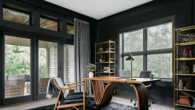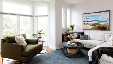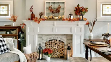
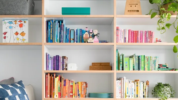
Open shelving presents one of the most deceptively difficult styling challenges in interior design. Empty shelves feel cold and cavernous, yet when loaded carelessly, they transform into visual clutter that overwhelms an entire living space. The goal of shelf styling is not to recreate a rigid library stack or stage a sterile catalog spread. It is to create a dynamic, balanced composition where every object has purpose, texture, and breathing room.
By treating open bookcases and floating ledges as three-dimensional canvases, you can blend functional storage with personal narrative. Achieving that polished look comes down to understanding visual weight, alternating geometric patterns with organic forms, and practicing deliberate restraint.
Stripping the Shelves and Managing Visual Weight
Every successful shelf-styling project begins with a clean slate. Leaving existing items in place and nudging them around rarely yields an intentional arrangement. Clear every single shelf, wipe down the ledges, and sort your decorative candidates by category across the floor or a nearby table. This allows you to evaluate your inventory, spot redundancies, and assess scale.
Once your shelves are bare, consider the principle of visual weight. Objects that are dark, bulky, opaque, or heavily textured feel physically heavier to the human eye than items that are pale, reflective, slender, or transparent.
As a general rule, anchor the lowest shelves with your heaviest items. Large storage baskets woven from water hyacinth, oversized art monographs, and hefty stone vessels belong near the base of the unit. Placing dense, dark objects at eye level or along the top perimeter makes a bookcase feel top-heavy and unstable. As your gaze travels upward, the items should gradually become lighter, airier, and more sculptural.
Using Books as Architectural Foundations
Books are the backbone of shelf styling, but treating them exclusively as vertical rows creates an unbroken monotony of vertical lines. Instead, use your books as architectural building blocks to introduce varied planes and heights.
Alternate between vertical groupings and horizontal stacks across different shelves:
-
Vertical arrangements: Group four to seven volumes together, standing upright. Use substantial bookends—such as carved marble blocks, cast-iron forms, or dense mineral bookends—or let the books lean gently against an upright shelf partition. To create visual rhythm, avoid lining books up in strict height order; staggering heights slightly creates a more casual, lived-in elegance.
-
Horizontal pedestals: Lay three to five books flat, placing the largest volume on the bottom and tapering up to the thinnest. These horizontal stacks serve two purposes: they introduce horizontal resting lines that break up vertical spine runs, and they double as elevated pedestals for smaller decorative accessories like brass magnifying glasses, ceramic bowls, or scented candles.
-
Curating spines and covers: You do not need to turn books backward with pages facing out to create a cohesive palette. Instead, remove glossy paper dust jackets to reveal the rich, matte linen or cloth-bound boards underneath. Grouping books loosely by tonal family—pairing deep earth tones together, or keeping pale creams and slates side by side—creates quiet harmony without feeling artificial.
Introducing Living Foliage for Organic Movement
Books, picture frames, and shelving units are predominantly rectilinear, filled with hard ninety-degree angles and flat planes. Introducing live indoor plants breaks this structural rigidity by bringing unpredictable curves, tactile leaves, and vibrant organic vitality into the arrangement.
When incorporating greenery, pay close attention to light exposure and watering logistics. Shelves set far from windows demand low-light cultivars that tolerate indirect illumination, while sunny alcoves welcome more demanding foliage:
-
Trailing vines on upper perches: Cascading species like Pothos, Heartleaf Philodendron, or String of Hearts are particularly effective when placed on middle or upper shelves. Their dangling tendrils spill over the edge of the shelf, physically connecting upper and lower tiers and softening the shelf’s horizontal line.
-
Sculptural plants for horizontal stacks: Compact plants with architectural silhouettes—such as a small ZZ plant, a Hoya Kerrii, or an upright Peperomia—anchor horizontal book stacks beautifully without demanding immense vertical clearance.
-
Planter materiality and moisture control: Select pots crafted from varied, matte materials like ribbed terracotta, raw stoneware, or hammered brass. Always ensure each planter sits inside a sealed saucer or utilizes a hidden plastic nursery pot liner; errant water leakage can permanently warp natural wood shelves and stain plaster walls.
Layering Depth and Curating Odd-Numbered Groupings
A common pitfall in amateur shelf styling is lining up decorative items in a single, straight file along the front edge of the ledge. This creates a flat, two-dimensional presentation. Dynamic styling demands that you use the entire depth of the shelf, from the back wall to the front lip.
Use the rule of thirds to build depth. Place a piece of framed art, an antique mirror, or a textured round woven tray flat against the back panel to serve as a backdrop. Slide a vertical cluster of books or a medium-sized ceramic vase slightly in front of it to establish the mid-ground. Finally, position a small trinket box or natural crystal in the foreground, slightly offset to one side. This overlapping technique draws the viewer’s eye into the shelf, creating layers that feel collected over time rather than staged in an afternoon.
When arranging freestanding decorative objects, group them in odd numbers, preferably sets of three or five. Pair items that contrast in both height and material. For example, combine a tall, slender matte-black iron taper candle holder with a squat, textured stoneware bowl and a smooth, polished brass bowl. The friction between diverse textures prevents the vignette from looking flat.
Incorporate personal artifacts that possess genuine history. A framed black-and-white family snapshot, a piece of sea glass brought home from a coastal vacation, or an antique compass found at a flea market carries far more emotional weight and visual charm than generic store-bought filler.
Embracing Negative Space and the Final Edit
The most powerful tool in any interior decorator’s arsenal is negative space—the intentional empty zones left untouched between objects. When every square inch of a shelf is stuffed with books, knick-knacks, and potted plants, the eye cannot rest, and individual treasures lose their visual significance.
Resist the impulse to bridge every gap. Leaving open space on either side of a sculptural vase or above a clean horizontal stack allows the adjacent objects to stand out with authority. Think of negative space as visual punctuation; without pauses, the entire arrangement turns into decorative noise.
Once your shelves are styled, step back at least eight to ten feet to inspect the overall balance. Squint slightly to blur out individual details and focus purely on silhouette and color distribution. Do you see clusters of heavy dark items on one side? Are the green plants distributed in a subtle zigzag pattern across the unit, or are they all clustered on the left?
Edit ruthlessly. Remove fifteen to twenty percent of the items you initially placed. If a vignette feels crowded or confusing, take one element away. What remains will feel lighter, intentional, and effortless.
Styling decorative shelves is an ongoing conversation between your personal memories and everyday design principles. By anchoring heavy forms, balancing rigid lines with soft greenery, and giving each piece room to breathe, you can craft a sophisticated installation that elevates your entire room.